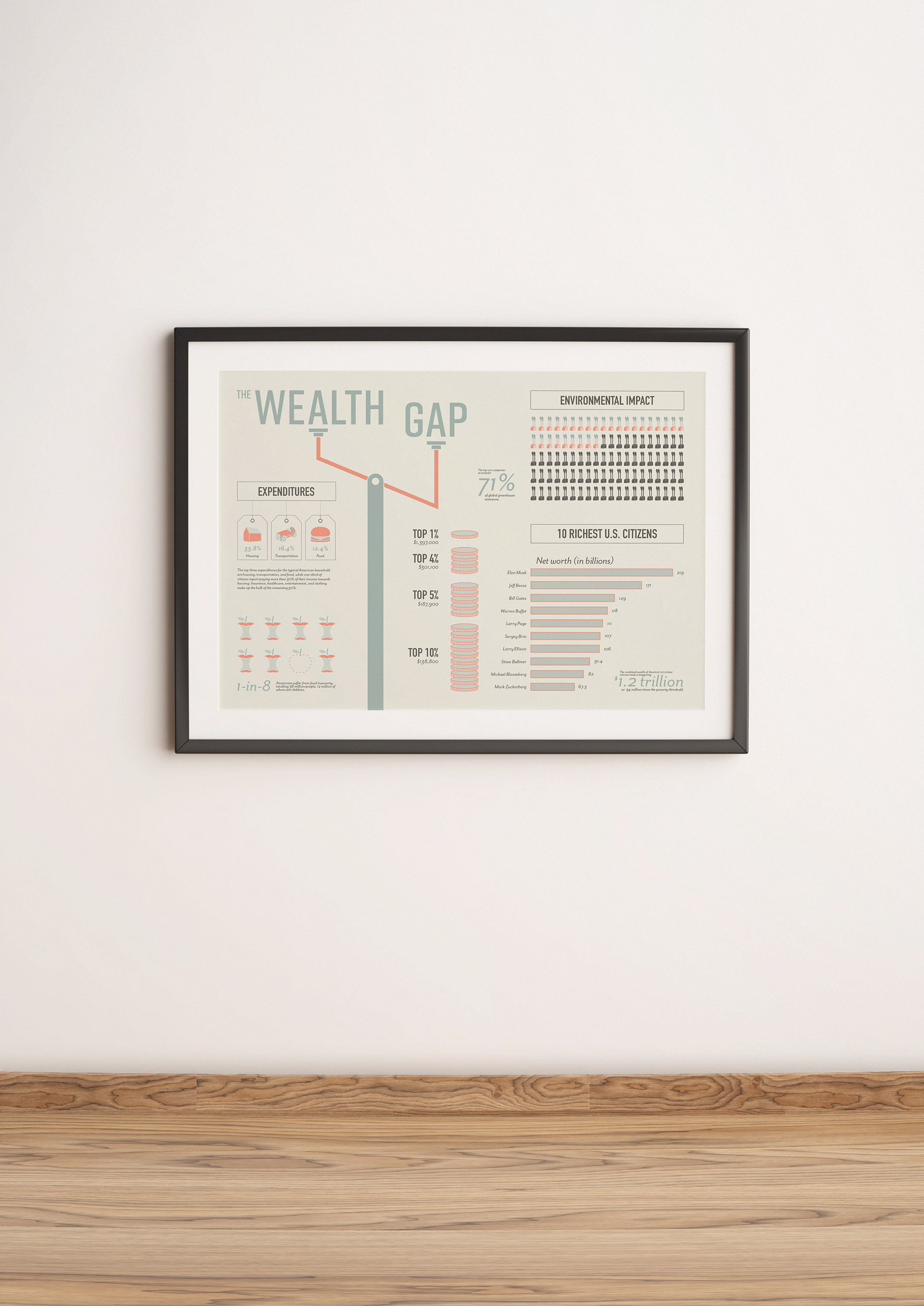
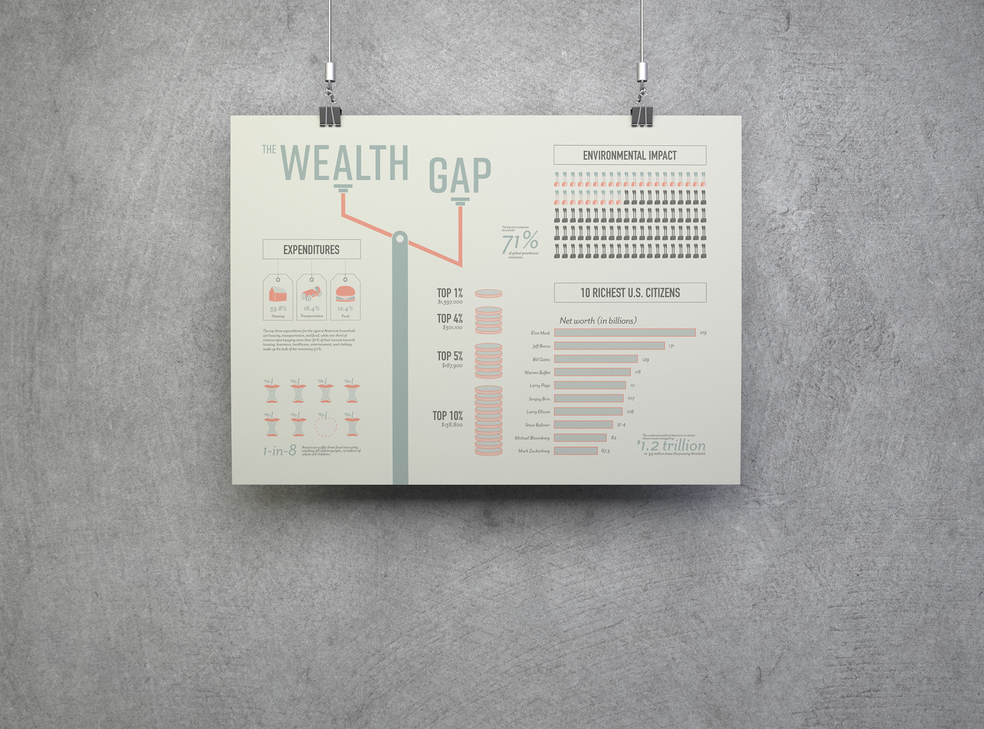
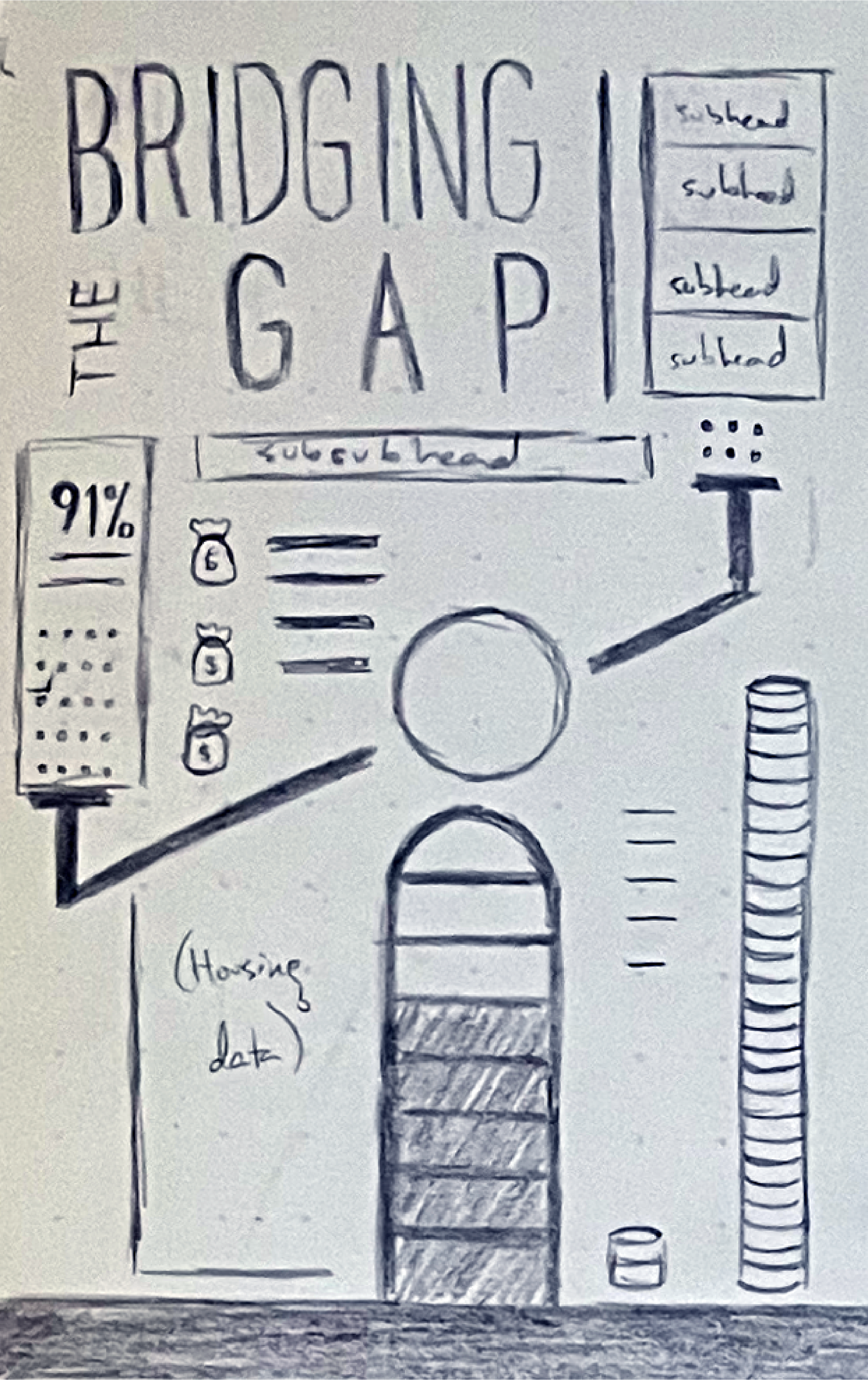
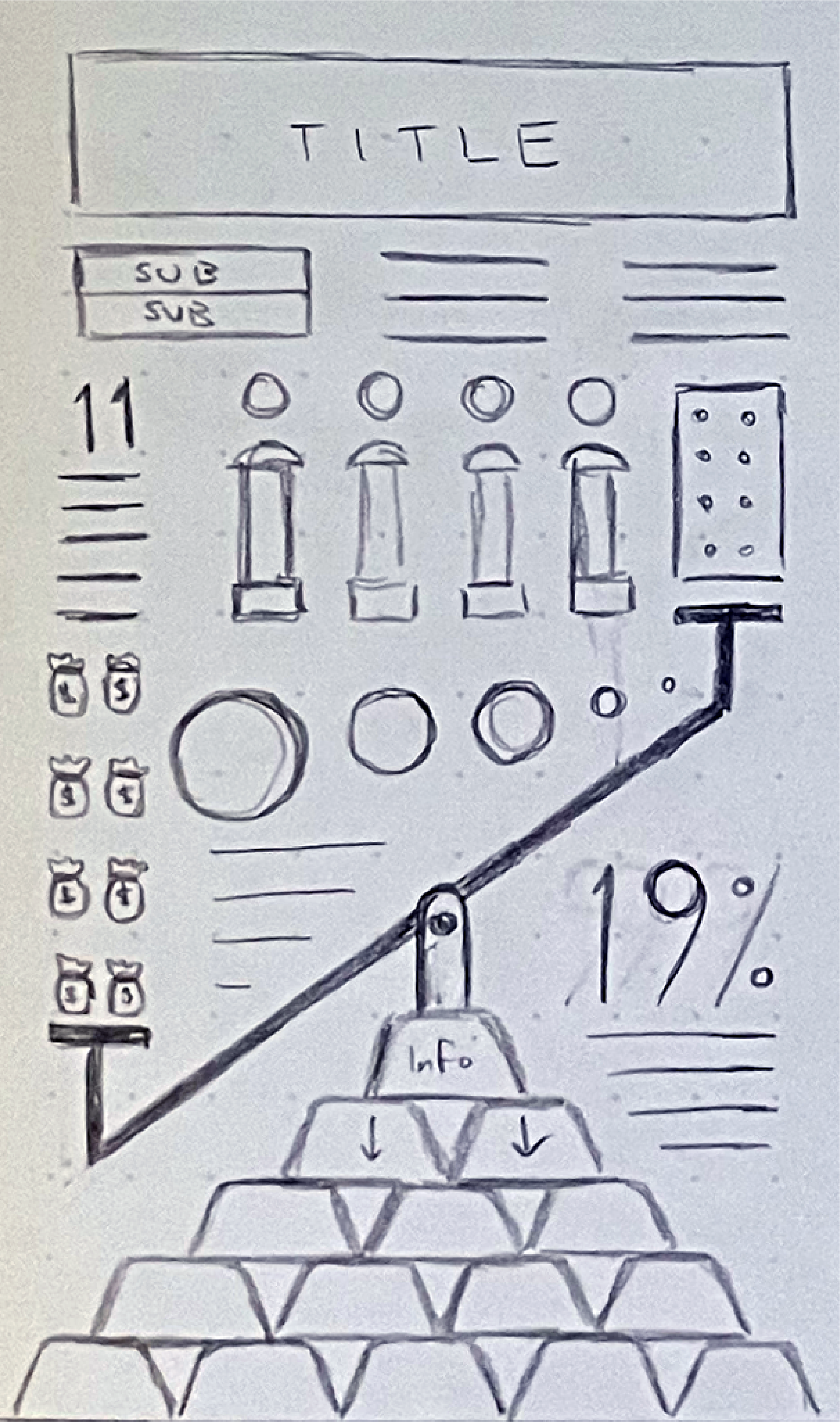
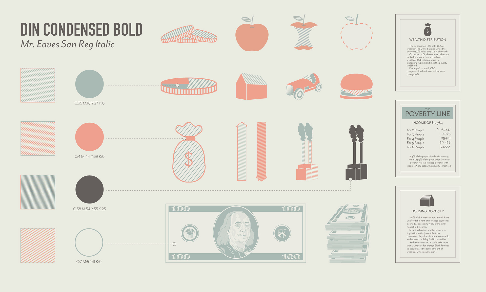
The Wealth Gap
Academic Project | Timeline: 4 weeks
Brief
Collect secondary data on topic of your choosing, make sense of collected data, and visualize data through an infographic.
Tone
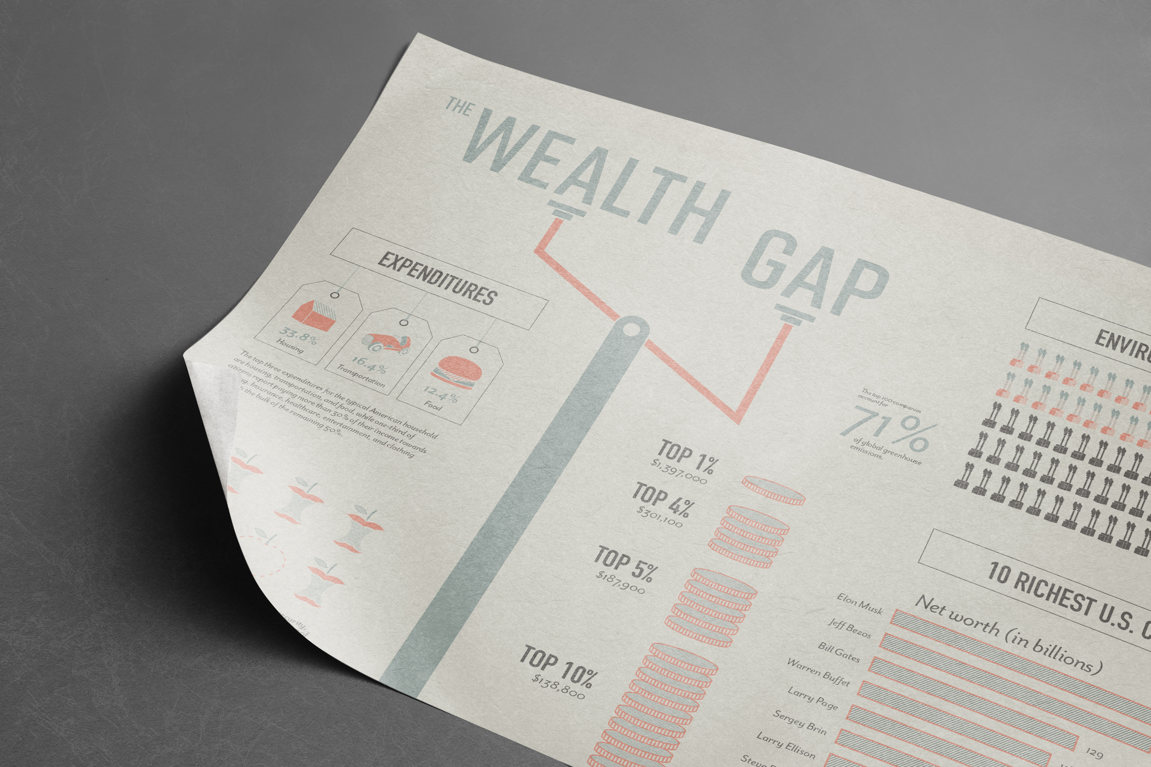
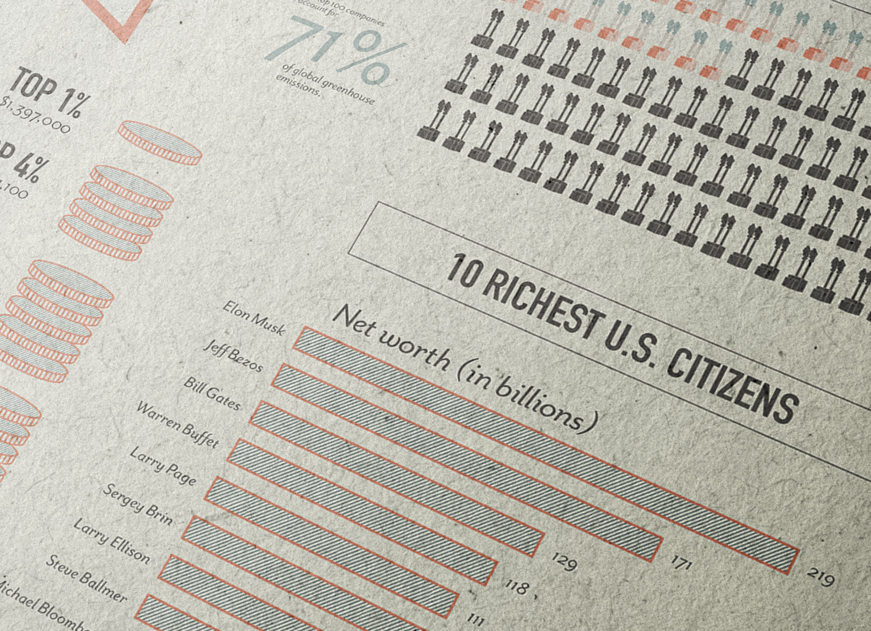
I had several aims for my visual style, primarily seeking to emulate a vintage, Americana style. Due to the content and emphasis on wealth disparity in the United States, I chose to base the stylization of graphics on American currency and elements of pop culture.
The diagonal line patterning is an homage to earlier lithographic printing, intended to give texture without overpowering the simplicity of the graphics.
Colors were intended to be a loose riff on the red, white, and blue, though I took a bit more liberty with the blue as I felt it made more sense to be a closer to the greenish-blue of American currency.
I felt type should be treated relatively simple, so selected DIN for headers and subheaders as it aligns with industrialism; for supporting text, I chose something that felt classic yet could contextually remain modern. Originally, I had considered using Mrs Eaves, but chose the counterpart typeface Mr Eaves as it felt more diverse in its application.